Promotional analysis, Time series forecasting, Intervention analysis
Many businesses are very seasonal, and some of them make money during holidays like Super Bowl, Labor Day, Thanksgiving, and Christmas. In addition, they use sales promotions to increase the demand for or visibility of a product or service for several weeks during the year.
In this post, we are going to analyze the historical data using time series analysis techniques, with promotion effect.
The data we are going to use is a weekly sales and price data for 9 stores and 3 products. At the end, we are going to forecast the sales for next 50 weeks for one of the three products at one of the stores. You can find the data set here.
The Data
- Store: the store code. We have 9 stores in total.
- Product: the product code. We have 3 products in total.
- Is_Holiday: an indicator for whether that week contains holiday: 0 = no, 1 = yes.
- Base Price: base or everyday price without discount.
- Price: Actual price for each week. They are either promotion prices when promotion is going on or everyday prices otherwise.
- Weekly_Units_Sold: Weekly units sold.
In the above data pre-processing, we added new feature like weekly sales amount in dollars, year, month, day, week of year.
EDA
To get the first impression about continuous variables in the data we are going to plot ECDF.https://towardsdatascience.com/media/cf0117e996b5d47292caaa4e2de34ad9ECDF.py
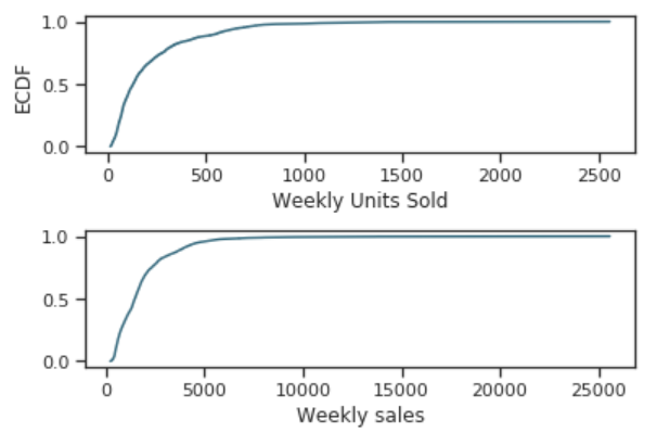
- Although in the best week, a store sold more than 2500 units, about 80% of the time, weekly units sold did not exceed 500.
- Although the highest weekly sales exceeded 25K dollars, over 90% of the data had weekly sales less than 5K dollars.
df.groupby('Store')['weekly_sales'].describe()

df.groupby('Store')['Weekly_Units_Sold'].sum()

- It is easy to see that Store 10 has the highest average weekly sales among all 9 stores, also Store 10 has the most total weekly units sold.
- And Store 5 has the lowest average weekly sales.
- Apparently, Store 10 is the most selling and crowded one.
g = sns.FacetGrid(df, col="Is_Holiday", height=4, aspect=.8)
g.map(sns.barplot, "Product", "Price");

g = sns.FacetGrid(df, col="Is_Holiday", height=4, aspect=.8)
g.map(sns.barplot, "Product", "Weekly_Units_Sold");
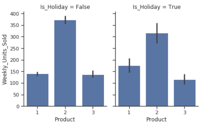
- Product 2 is the cheapest product among all the three products, and it sells the most.
- Product 3 is the most expensive product among all the three products.
- In addition, product price did not change during holidays.
g = sns.FacetGrid(df, row="Is_Holiday",
                  height=1.7, aspect=4,)
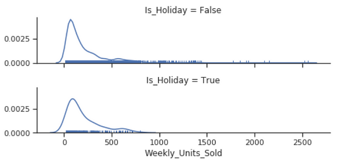
g.map(sns.distplot, "Weekly_Units_Sold", hist=False, rug=True);
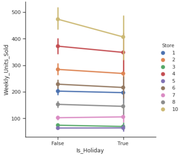
sns.factorplot(data= df,
               x= 'Is_Holiday',
               y= 'Weekly_Units_Sold',
               hue= 'Store');
sns.factorplot(data= df,
               x= 'Is_Holiday',
               y= 'Weekly_Units_Sold',
               hue= 'Product');
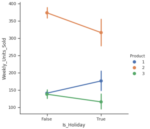
- It does not seem that holidays have a positive impact for the business. For most of the stores, weekly unit sold during the holiday is as same as the normal days, while store 10 had a decrease during the holidays.
- Weekly units sold for product 1 had a slightly increase during the holidays, while product 2 and product 3 had a decrease during the holidays.
g = sns.FacetGrid(df, col="Product", row="Is_Holiday", margin_titles=True, height=3)
g.map(plt.scatter, "Price", "Weekly_Units_Sold", color="#338844", edgecolor="white", s=50, lw=1)
g.set(xlim=(0, 30), ylim=(0, 2600));
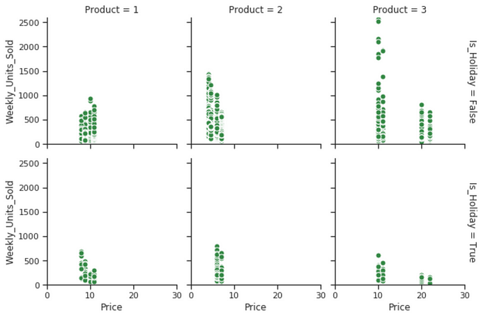
- Every product has more than one prices, both at holidays and normal days. I guess one is regular price, another is promotional price.
- The price gap for product 3 is huge, it was slashed to almost 50% off during promotions.
- Product 3 made the most sales during non-holidays.
g = sns.FacetGrid(df, col="Store", hue="Product", margin_titles=True, col_wrap=3)
g.map(plt.scatter, 'Price', 'Weekly_Units_Sold', alpha=.7)
g.add_legend();
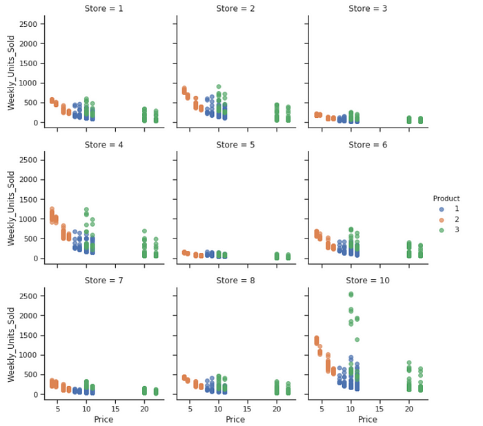
All of these 9 stores carry these 3 products. They all seem to have similar kind of discount promotions. However, product 3 sells the most units during promotions at store 10.
g = sns.FacetGrid(df, col="Store", col_wrap=3, height=3, ylim=(0, 1000))
g.map(sns.pointplot, "month", "Weekly_Units_Sold", color=".3", ci=None, order = [1,2,3,4,5,6,7,8,9,10,11,12]);

Every store has somewhat seasonality, store 10 has the most obvious seasonal pattern.
g = sns.FacetGrid(df, col="Product", col_wrap=3, height=3, ylim=(0, 1000))
g.map(sns.pointplot, "month", "Weekly_Units_Sold", color=".3", ci=None, order = [1,2,3,4,5,6,7,8,9,10,11,12]);

Every product has somewhat seasonality, product 2 has two peak seasons per year and product 3 has one.
g = sns.FacetGrid(df, col="Store", col_wrap=3, height=3, ylim=(0, 2000), hue='Product', palette="Set1")
g.map(sns.pointplot, "month", "Weekly_Units_Sold", ci=None, order = [1,2,3,4,5,6,7,8,9,10,11,12], alpha=.7)
g.add_legend();

- In general, product 2 sells more units per week than the other products in every store.
- Once a while, product 3 would exceed product 2 at store 10.
g = sns.PairGrid(df, y_vars=["Weekly_Units_Sold"], x_vars=["Price", "Is_Holiday"], height=4)
g.map(sns.regplot, color=".3");
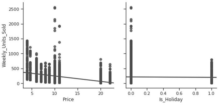
- The cheaper the price, the more weekly units were sold.
- Is holiday or not has nothing to do with the unit sold.
Here we are adding a new column called “promotion”, which was derived from “Base Price” and “Price”.https://towardsdatascience.com/media/6212c5907b8aab28c5537dc0d2bda371promotion.py
sns.factorplot(data= df,
               x= 'promotion',
               y= 'Weekly_Units_Sold',
               hue= 'Store');

Every store sells more during the promotions, there is no exception.
sns.factorplot(data= df,
               x= 'promotion',
               y= 'Weekly_Units_Sold',
               hue= 'Product');
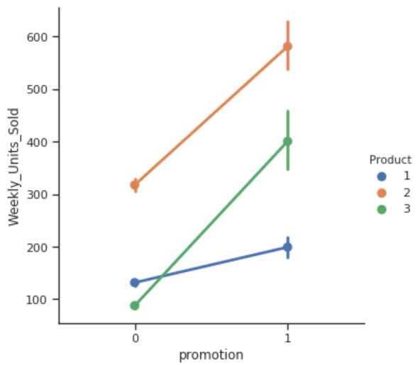
Every product sells more during the promotions, in particular, product 2 and product 3.
g = sns.FacetGrid(df, col="Store", hue="promotion", palette = 'plasma', row='promotion')
g = (g.map(plt.scatter, "Price", "Weekly_Units_Sold")
     .add_legend())

All the stores have the similar price promotion pattern, for some reason, store 10 sells the most during the promotions.
g = sns.FacetGrid(df, hue="promotion", col="Product", height=4)
g.map(qqplot, "Price", "Weekly_Units_Sold")
g.add_legend();

Every product has the regular price and promotional price. Product 3 has the highest discount and sells the most during the promotions.
Observations
- The most selling and crowded Store is Store 10, and the least crowded store is Store 5.
- In terms of number of units sold, the most selling product is product 2 throughout the year.
- Stores do not necessarily run product promotions during holidays. Holidays do not seem to have an impact on stores or products performance.
- Product 2 seems to be the cheapest product, and Product 3 is the most expensive product.
- Most stores have some kind of seasonality and they have two peak seasons per year.
- Product 1 sells a little more in February than the other months, Product 2 sells the most around April and July, and Product 3 sells the most around July to September.
- Each product has its regular price and promotional price. There isn’t significant gap between regular price and promotional price on Product 1 and Product 2, however, Product 3’s promotional price can be slashed to 50% of its original price. Although every store makes this kind of price cut for product 3, store 10 is the one made the highest sales during the price cut.
- It is nothing unusual to sell more during promotion than the normal days. Store 10’s made Product 3 the best selling product around July to September.
Time Series with Prophet
We are going to build a time series analysis for product 3 at store 10, and we are going to forecast weekly sales in dollars.https://towardsdatascience.com/media/a6639faf93900c043ae5e582e8baa310timeseries_viz.py
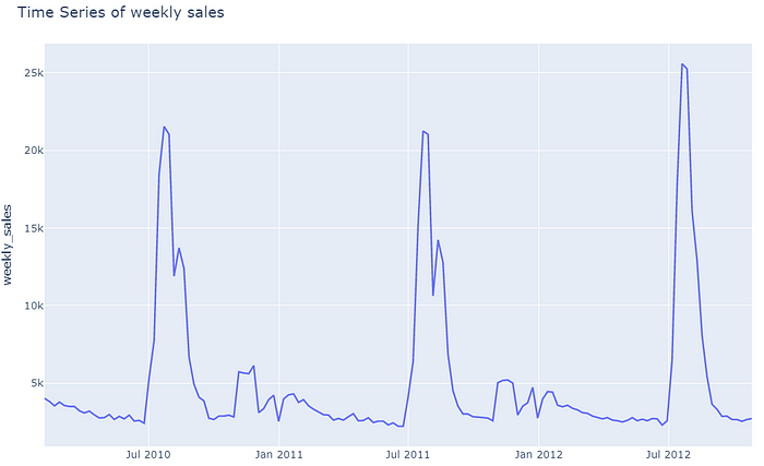
Product 2’s seasonality at store 10 is obvious. The sales always peak between July and September during school holiday.
Below we are implementing prophet model, forecasting the weekly sales for the future 50 weeks.https://towardsdatascience.com/media/95be9d741ae62f0d31167fb8e3a398c7
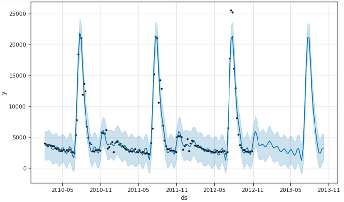
The model was able to capture the seasonality.
model.plot_components(forecast);

metric_df = forecast.set_index('ds')[['yhat']].join(store_10_pro_3.set_index('ds').y).reset_index()
metric_df.dropna(inplace=True)
error = mean_squared_error(metric_df.y, metric_df.yhat)
print('The RMSE is {}'. format(sqrt(error)))

Seasonality effect
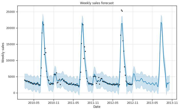
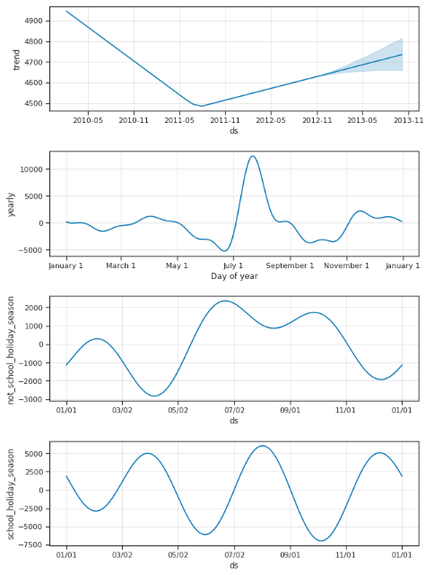
A great thing about Prophet is that we can add our own custom seasonalities. Here we are going to add school holiday season that spans from early July to early September.https://towardsdatascience.com/media/e8caf56454d06816e020efafabdcfe22add_seasonality.py
metric_df = forecast.set_index('ds')[['yhat']].join(store_10_pro_3.set_index('ds').y).reset_index()
metric_df.dropna(inplace=True)
error = mean_squared_error(metric_df.y, metric_df.yhat)
print('The RMSE is {}'. format(sqrt(error)))

The RMSE decreased a little.
model.plot_components(forecast);
Jupyter notebook can be found on Github. Enjoy the rest of the week!
